When I speak to business owners about branding, I often hear things like "I just picked colours I liked."
It's a risky move.
Colour psychology in marketing isn't about personal preference, it's about influence. The colours you choose shape perception, build trust, and ultimately affect whether someone chooses your business or scrolls past it.
If you're an SME looking to stand out in a crowded market, understanding brand colour psychology is one of the simplest and most powerful wins available to you.
Let me break it down in a practical, no-nonsense way.
Why Colour Psychology Matters in Marketing
Before someone reads your headline or understands your offer, they've already formed an impression of your brand, and colour plays a huge role in that.
In fact, colour can:

Increase brand recognition
Influence buying decisions
Communicate trust and credibility
Trigger emotional responses
At Make Me Local, everything we do is about helping businesses grow sustainably. Your brand colours should support that goal, not work against it.
What Is Brand Colour Psychology?
Brand colour psychology is the strategic use of colour to influence how people perceive your business.
Different colours trigger different emotional responses — and sometimes instantly, like a red flag to a bull. The key is aligning those emotions with:
Your Audience
Your Offering
Your Brand Values
If those three don't match, your branding creates confusion, and confused customers don't convert.
Colour and Mood: What Your Brand Is Really Saying
Here's a simple psychology colour wheel you can use as a starting point:

This isn't about rigid rules, it's about understanding how colour and mood work together to influence behaviour.
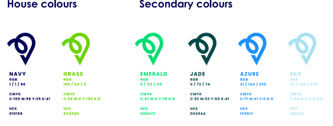
The Meaning Behind Make Me Local Brand Colours
Here's how our brand colours map to what we stand for:
When I built Make Me Local, every decision came back to one question:
"What do our customers need to feel in order to trust us?"
Our clients are business owners who want growth, leads, and clarity. They need a partner they can rely on.
That's why we use:
Blue
To signal trust, expertise, and accountability
Green
To represent growth, sustainability, and long-term results
Those colours aren't accidental. They reinforce our messaging:
Outcome-focused
Honest and approachable
Partnership-led
Expert & forward thinking
Your brand should do the same — visually communicating your values before you say a word.
How to Choose the Right Branding Colours for Your Business
If you're starting out or considering a rebrand, here's the exact process I recommend:
Start With Your Audience
Who are you trying to attract?
A corporate decision-maker will respond very differently to colour than a lifestyle consumer. If you get this wrong, your brand will feel "off", even if people can't explain why.
Define the Emotion You Want to Create
Ask yourself:
Do I want to appear trustworthy?
Premium?
Energetic?
Approachable?
Your answer should directly influence your colour choices.
Match Colour to Your Value Proposition
Your colours should reinforce what you do.
For example:
Growth-focused service
Green
Premium offering
Black or Deep Tones
Fast-paced service
Red or Orange
If your visuals contradict your message, you lose credibility.
Keep It Simple
So many businesses overcomplicate their palette.
There's nothing wrong with sticking to:
1 Primary Colour
1–2 Secondary Colours
Neutral Tones for Balance
Consistency beats complexity every time.
Think Beyond the Logo
Your brand colours should work across:
Email marketing
Sales materials
Signage
If your colours don't translate well across channels, they're not doing their job.
Common Mistakes to Avoid
Let me save you some time, here's what not to do:
Choosing colours based on personal taste
Copying competitors too closely
Using too many colours
Ignoring accessibility (contrast matters)
Not applying colours consistently
Branding isn't decoration, it's strategy.
If there's one thing I want you to take away from this, it's this: Your brand colours are not just design choices, they're business decisions.
Done right, they: Build trust faster, make your brand more memorable, improve conversion rates, and support long-term growth.
At Make Me Local, we don't just help businesses look good — we help them perform. And colour psychology in marketing is one of the foundations of that performance.
If you're serious about growing your business, it's worth getting this right.
Need help refining your brand or generating more leads? That's exactly what we do.

About Nathan
Make Me Local Founder & Author
Nathan is a digital strategy expert at Make Me Local, helping businesses navigate the complexities of their online presence. With years of experience in web development and client relations, he specializes in translating technical jargon into clear, actionable business advice.
View all posts